
UX Learning & Dev
Training design product for warehouse associates at scale, built on systems that work across every screen, role, and device.
A single design system built for 20,000 people, trained on the tools they use every day.
A learning product built to scale
Designed a template system, UI component library, and visual asset collection for AMXL (Amazon's Extra Large delivery network) IAT (In-App Training, where associates learn directly on the tools they use at work, no classroom required).
Technical Instructional Design Developers now had their own templates, images, animations, interactive 3D experiences, videos, and UI components to build from, giving AMXL training a consistent visual identity across every course, role, and device.


Old System

The problem
AMXL's Technical Instructional Design Developers had no templates, visual assets, or UI components of their own. To build courses, they pulled from other teams' templates, which meant the visual language varied from course to course. There were no owned images, animations, videos, or interactive experiences to draw from, and no consistent look to tie AMXL training together across the broader catalog.
The solution
Built a dedicated template system for AMXL courses, grounded in Amazon's OIC (Operations Internal Comms) brand standards. It includes a full library of UI components, images, animations, interactive 3D experiences, and videos that Technical Instructional Design Developers could pull from directly. The main training surface is a workstation, a portable cart with a laptop that warehouse associates access on the floor, with the same system extending across a second device entirely.

Color signals context. The top bar changes with each slide type to tell learners what kind of moment they are in: reading, safety, practice, feedback, or action.


What I built
A reusable UI kit and 3D library that gives Technical Instructional Design Developers a complete building system. The kit covers layout hierarchy, type scale, spacing, navigation, feedback states, icon style, and motion, so every course they build feels polished and consistent regardless of the content type or device it runs on.
Every color ties back to the OIC system, keeping the visual language consistent from brand materials to screen.
Motion follows the same logic, built as shared reusable animations rather than one-off effects that vary course to course.
Every color has a job.
Each color maps directly to a learning moment and is pulled from the OIC system, so learners know what kind of slide they are on before they read a single word.
Default - Squid Ink
Action - Prime Blue
Interactive - Orange
Safety - Yellow
Quiz - Purple
Correct - Green
Incorrect - Red
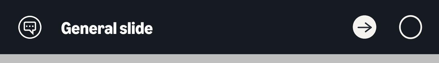
Navigation that sets expectations
The top bar stays the same across every slide. Color and icon choices signal what kind of moment learners are in before they read a single word: information, safety, practice, feedback, or quiz.

An icon on the left identifies the slide type. Navigation arrows on the right move learners forward or back. The center indicator shows the current mode at a glance, reducing confusion and keeping learners moving on both the workstation and the Zebra handheld scanner.
Icons that separate meaning from navigation
Two icon sets work together: communication icons explain the moment, navigation icons move the learner through it.
Icon colors come from the OIC system, so every slide type carries a consistent visual signal learners can recognize before they start reading.
Communication icons Sets expectations at a glance across info, safety, practice, and feedback moments.


Navigation Icons Standardizes how learners progress, revisit, or confirm actions.


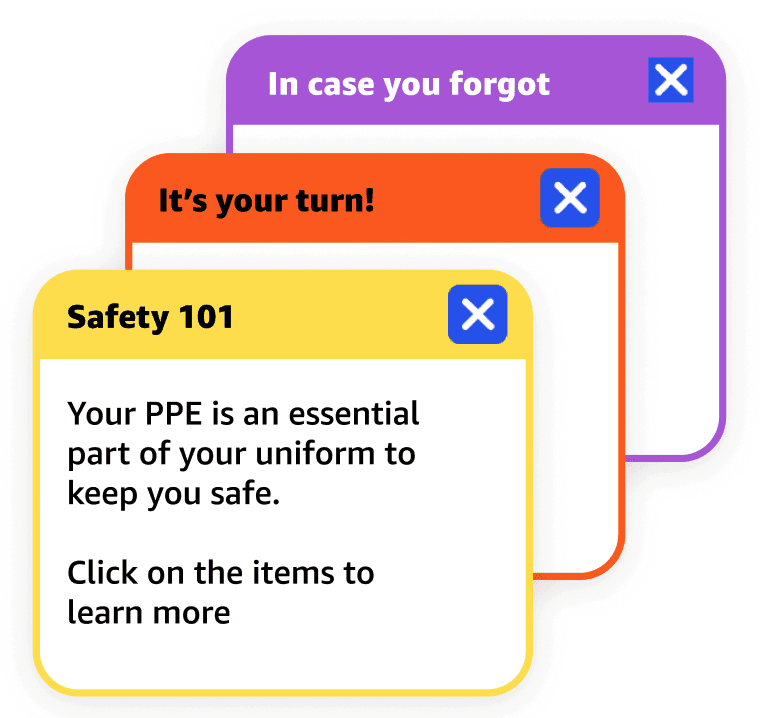
Callouts that don't break the flow
Contextual annotations surface reminders, prompts, and course info without interrupting the learning sequence. Each callout inherits its color from the OIC system, so the visual language stays consistent from navigation to content.

Motion System
Like color and icon language, motion was treated as a system decision, not a styling choice.
Subtle animation reinforces hierarchy, responsiveness, and spatial clarity within platform constraints. Because the delivery platform limited native animation controls, motion behaviors were designed as reusable animated assets and hover states, optimized for low-bandwidth warehouse environments, exported at 24fps, and built on consistent timing and easing rules to stay cohesive across modules.

System Rule
Micro-animations resolve in 550 to 600ms. Loop cadence is 15s idle activation. Behavior is accelerated entry with soft motion amplitude, subtle and non-disruptive.
Icon Rotation
Duration: 575ms at 24fps. Easing: cubic-bezier(0.82, 0.00, 0.63, 1.00). Accelerated entry with soft deceleration for a non-mechanical finish.
System Rule (Interactive Motion)
Interactive feedback resolves faster than ambient motion, between 300 and 350ms. Directional entry reinforces forward progression. Motion is responsive and spatial, reinforcing directional intent.
Arrow Entry (Representative Motion)
Duration: ~333ms (24fps) Easing: cubic-bezier(0.66, 0.00, 0.34, 1.00) Behavior: Arrow enters from left → settles center → exits right, reinforcing forward movement
Built once, used everywhere
As the only designer supporting an organization of 20,000 people, building efficiency into every asset was not optional. 3D made that possible. A single scene could produce dozens of outputs: shift the camera angle and you have a new image, swap an object and you have a new scenario, all without rebuilding from scratch. This modular approach meant the same library served IAT slides, Storyline courses, and print materials across the entire AMXL training catalog without starting over for each one.


Taken further with Spline
Those same 3D models were extended into Spline, making them interactive directly inside the training experience. As the first designer to bring Spline into Amazon internally, the assets that already defined the visual identity of AMXL training could now be explored by learners in real time, showing exactly how far a single well-built library could reach across formats, devices, and experiences.
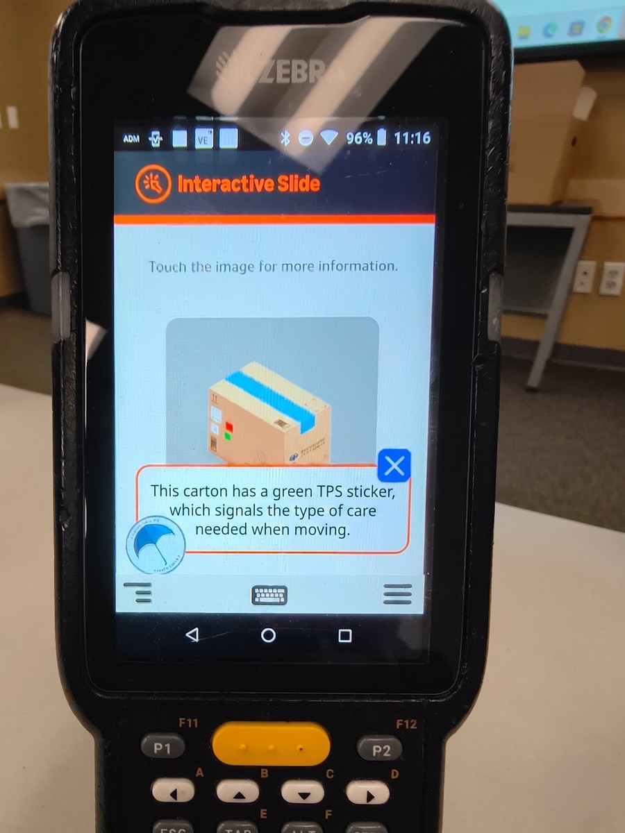
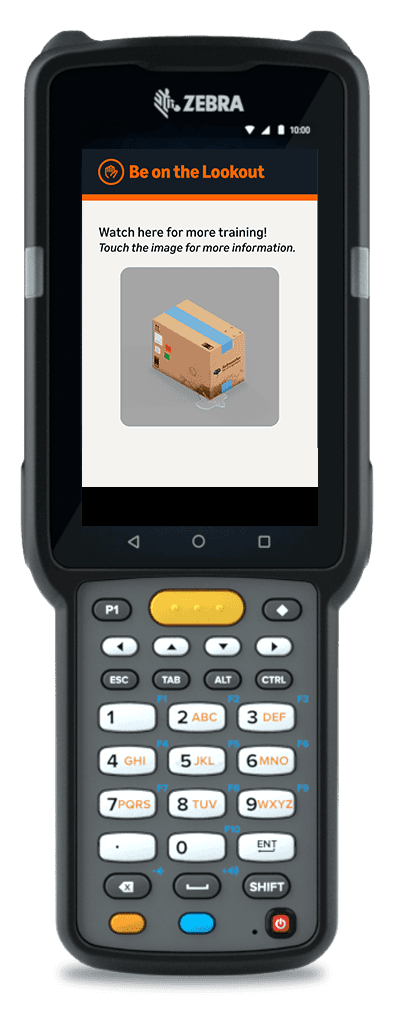
Scaled to the handheld
The same design system extended to Zebra handheld scanners used on the warehouse floor. Smaller screens, gloved hands, and high-ambient-light environments required rethinking touch targets, type sizes, and navigation patterns while keeping the visual language consistent with the workstation experience.


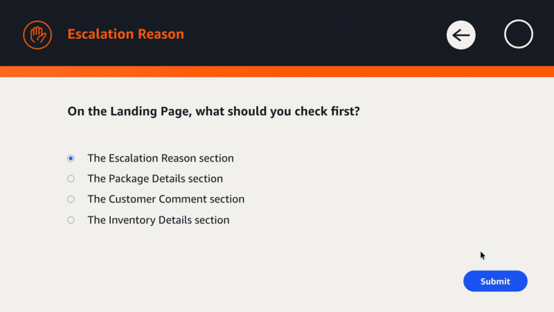
Knowledge checks that feel like product UX
3D rendered objects serve as answer choices, giving learners something to see and compare rather than reading through text-heavy options.
Feedback states, button hierarchy, and visual cues stay consistent across every training and device, so learners always know what action to take and what just happened. Idle animations keep the experience feeling alive between interactions, and every button responds on hover so nothing feels flat or unfinished.
Correct state
Incorrect state

One system. Every screen.
Handscanner
Workstation

